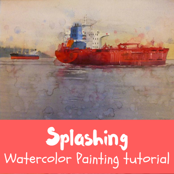
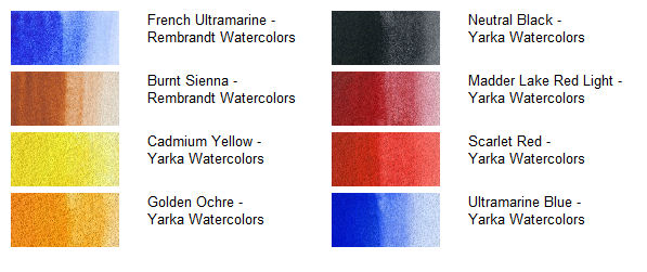
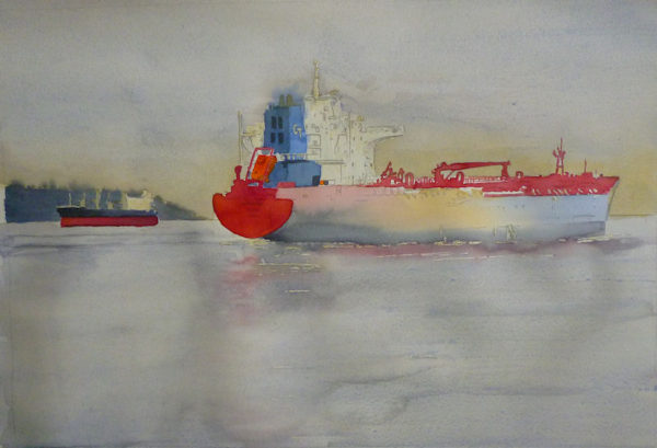
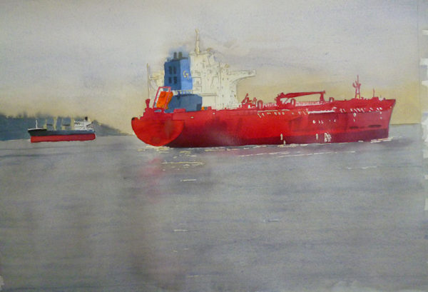
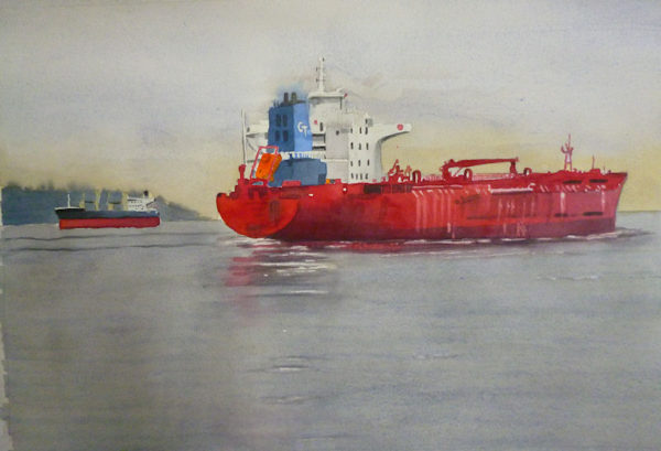
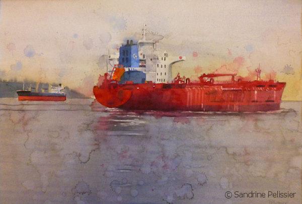
Freighters are a common sight in Vancouver, I always liked the colors and especially that bright red on the cargo ships. I also wanted to try a specific paper with the splashing technique : Aquarius by Strathmore after reading Leslie White’s post here where she tried it : http://lesliepaints.wordpress.com/2012/02/09/white-tiger/ Here is my palette for this painting:
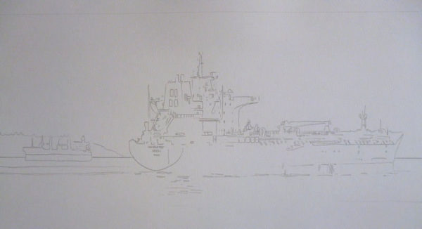
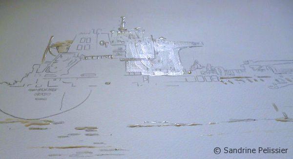
I start by drawing on my paper , Aquarius Starthmore II that is “an innovative combination of cotton and synthetic fibers “
I reserve a few whites area before starting to paint with masking fluid.
I am a Blick Art Materials affiliate and I receive a small compensation for sales. That does not effect in any way the cost of the purchaser’s order but it helps me keeping the content of this blog free.
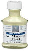
This fluid is used to create striking white highlights or to mask areas for overpainting at a later stage. It forms a fast-drying, water-resistant film on watercolor paper and board, and is easily removed when dry.
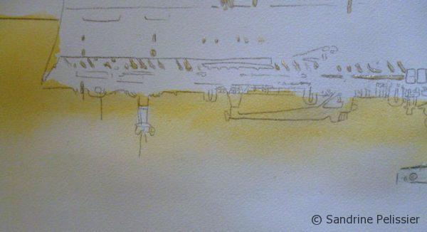
I start by painting a gradated wash in the shy area with Cadmium Yellow
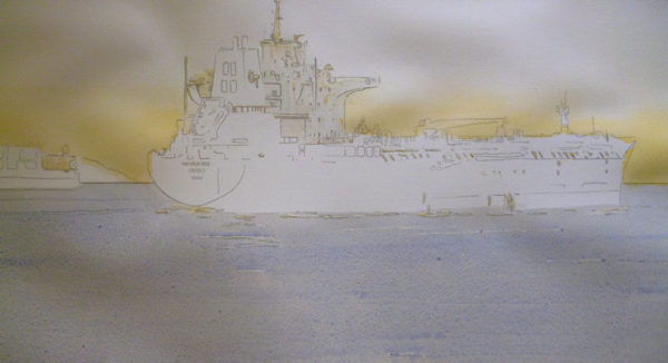
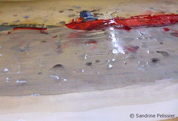
I paint a wash on the sea area with a mix that I will use all along this painting: Ultramarine blue and Burnt Sienna.
Working on the sky with that same mix of Ultramarine and Burnt Sienna, I like the granulation effect you obtain with that mix.
I continue painting, trying to use a color in different parts of the paintings each time it is introduced.
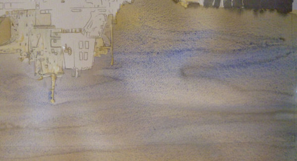
Here I am almost done with the cargo ships and am removing the masking fluid to work on the preserved areas.
I am a Blick Art Materials affiliate and I receive a small compensation for sales. That does not effect in any way the cost of the purchaser’s order but it helps me keeping the content of this blog free.
Same palette of traditional colors the great masters used a century ago. Liquid-poured means semi-moist pans respond instantly to a wet brush. 24 pans in plastic case. Also individual pans. – Master Set
I add a bit of paint for the reflections in water and soften a bit some edges where the masking fluid has made hard edges.
Originally from France, I have been living in North Vancouver, Canada for the past 20 years.
My work has been collected and exhibited extensively in Canada and internationally. I am also part of the Art Rentals and sales program of the Vancouver Art Gallery.
Many of my paintings have been published in Art books and magazines (Artist Magazine, Watercolor Artist Magazine, Acrylic Magazine, International Artist Magazine). I wrote 2 art instruction books with North Light/F+W Books.
I have been writing for the last 5 years for my blog: paintingdemos.com, that has a mailing list of about 10 000 subscribers and about 20 000 visitors per month.
I am an active member in the community, as a co-founder of the North Shore Art crawl, a co-founder of a weekly life drawing group, a board member of the North Vancouver Arts Council, and have been invited as a juror for public art, art grants and juried exhibitions. You can read more about my collaborations here.
[…] blossoms, cherries and magnolias….Wings over Artemis – Coast Character Doll ArtistsFreighters, Watercolor on paperWheezy Pleases EveryoneNS Art CrawlCuba: Media tries to sew a silk purse out of a sow’s […]
[…] for our North Shore Art Crawl 2011 VideoFreighters, Watercolor on paperFreighters, Watercolor on paper ul.legalfooter li{ list-style:none; float:left; padding-right:20px; } .accept{ display:none; […]
Oh Damn that’s really nice, I do have a question though, why the random splashes and not something more, for sake of a better wod ‘controlled’ ? Great stff though, Love IT!
Thank you so much Sandrine. I don’t know how you have the patience to so carefully document your work and share it with us. It means a lot to me. And I find this work particularly evocative.
Thanks Collage collection , I sometimes get caught up and miss a few pictures , I am glad you liked the demos 🙂
designcloseup
Hi Sandrine,
The red and the blue contrast very beautifully. The combination of the 2 shades of red, particularly the spattering of madder red lake, gives so much depth to define the edges of the boat. Well done
This is really attractive, Sandrine. Your painting looks “wetter” on this paper. I like how the spritzing worked on this, in particular. Thank you for trying this paper. It helps to see another artist’s work on it.


Comments (20)
Floating barrels, watercolor and watercolor crayons on paper « Sandrine Pelissier's Blog
[…] Freighters, Watercolor on paper […]
Read As Red
[…] blossoms, cherries and magnolias….Wings over Artemis – Coast Character Doll ArtistsFreighters, Watercolor on paperWheezy Pleases EveryoneNS Art CrawlCuba: Media tries to sew a silk purse out of a sow’s […]
elev8design
Looks great
North Shore Art Crawl
[…] for our North Shore Art Crawl 2011 VideoFreighters, Watercolor on paperFreighters, Watercolor on paper ul.legalfooter li{ list-style:none; float:left; padding-right:20px; } .accept{ display:none; […]
Harley Manifold
Oh Damn that’s really nice, I do have a question though, why the random splashes and not something more, for sake of a better wod ‘controlled’ ? Great stff though, Love IT!
mypathforward
thanks for this – beautiful!
judi
Thank you so much for sharing. I can’t wait to try the method.
Sandrine Pelissier
Thanks Judi, let me know how it works for you 🙂
Nuno
Thank you very much, Sandrine. I love these posts where you describe the process.
Sandrine Pelissier
Thanks Nuno !
Collage Collection
Thank you so much Sandrine. I don’t know how you have the patience to so carefully document your work and share it with us. It means a lot to me. And I find this work particularly evocative.
Sandrine Pelissier
Thanks Collage collection , I sometimes get caught up and miss a few pictures , I am glad you liked the demos 🙂
designcloseup
Hi Sandrine,
The red and the blue contrast very beautifully. The combination of the 2 shades of red, particularly the spattering of madder red lake, gives so much depth to define the edges of the boat. Well done
Sandrine Pelissier
Thanks designcloseup, I am glad you like it 🙂
lesliepaints
This is really attractive, Sandrine. Your painting looks “wetter” on this paper. I like how the spritzing worked on this, in particular. Thank you for trying this paper. It helps to see another artist’s work on it.
Sandrine Pelissier
Thanks Leslie, you are an inspiration for me to try new techniques and materials 🙂
zeebradesigns
you amaze me! not only prolific, but also disciplined to take photos as you progress! great work, as always! z
Sandrine Pelissier
Thanks zeebradesigns !!!
Mary Lou Rutledge
Love it especially the red…
Sandrine Pelissier
Thanks Mary Lou, I seem to be in a “red” period too 🙂